
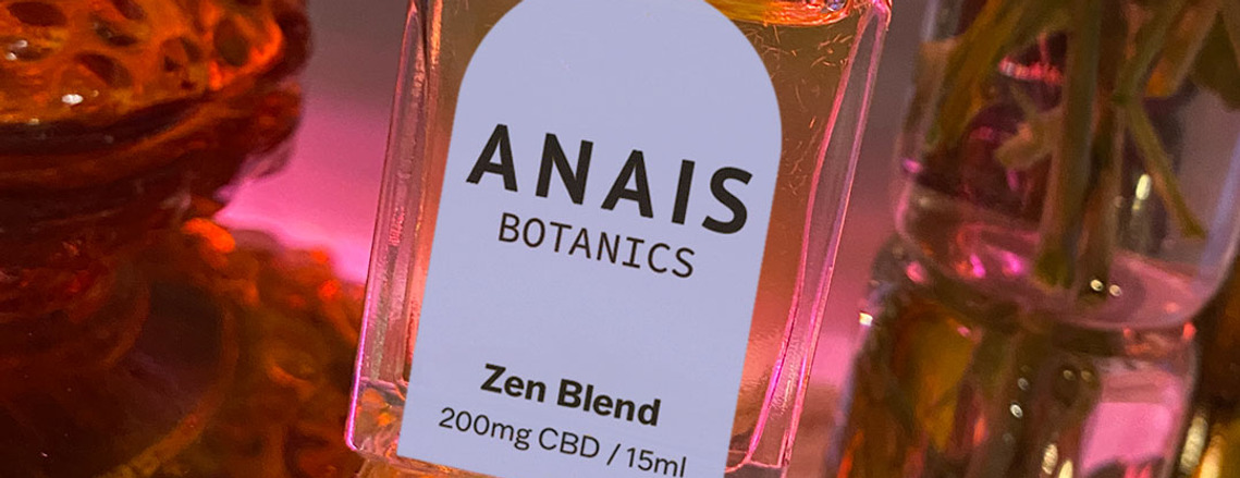
Anais Botanics
Branding + Packaging
Anais Botanics is an aromatherapy skincare brand that I developed and created in 2021, and launched in the spring of 2022. I am passionate about taking care of my skin, and the ingredients I put on it, so took it upon myself to make skincare products that are effective for different modalities, and are created using natural and organic ingredients so that there's no question as to what's in it.
The task of developing branding and the packaging was quite the challenge as I was the client. I wanted the brand to be natural and organic by practice, but didn't necessarily want it to look like other natural and organic products on the market. I was influenced by psychedelic imagery and fonts, so wanted to incorporate some whimsy and play in the design as well.
For the most part, the packaging is clean and easy to read, using a color-coded system to easily identify the different modalities of treatment, for example: orange is connected with the pain blend, purple is for anxiety, pink is for pms, and lime green represents an energy blend. The different blends help with different issues the user may have, so I have decided to color code the line of products that will continue with each category.


Social


Logo Design
The brand as a whole has a nod to whimsy and play, and we wanted to incorporate that in the logo. By using a clean sans serif font the logo will translate on various platforms and mediums including web and print. We incorporated the playful whimsy element by adding curvatures on the ligaments of the letters, making them a bit more sensual. I wanted to add a little more femininity and uniqueness and extended ligatures on the "a" and "n" letters to achieve that.